Notion Review
This is a review of some of Notion's desktop interactions.
I love Notion, it changed my life. It is incredibly useful, and I use it to keep my personal and professional tasks organised.
As a frequent Notion user, I have a few suggestions for enhancements, which I will outline in this review.
Consistency
I am a "Don't Make me Think" fan, and I appreciate seeing the same component in the same place every time I need to use it. When I want to Delete something, I want to find the Delete component in the same place, or at least near, the place I found it before. I need consistency,
The fourth Nielsen Usability Heuristic is Maintain Consistency and Adhere to Standards. According to it, when websites and applications adhere to standards, users know what to expect, learnability is increased, and confusion is reduced.
1.1 The "Delete" location 🗑️
The images below show the Delete function in three different places, on the top, in the middle and in the end.
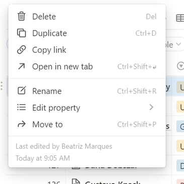
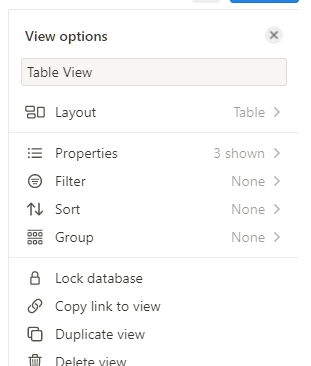
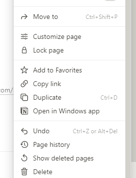
My suggestion is to apply card sorting to solve this inconsistency and organise these menus so the Delete remains in similar places every time a menu opens.
1.2 Now you see me, now you don't 🃏
The Delete property is not available in all columns. The video above shows that the middle column doesn't have the Delete property.
1.3 Click outside to close it 🖱️
The first time I saw this "click anywhere outside this active window to close it" interaction was on Twitter. I don't understand why this interaction is so widely used because is not intuitive at all.
Notion uses this interaction, but the real issue is that the outcome is not always the same.

You can see the actions reported in this table in the video below.

These are all my perspective as a user. It would be necessary to run some usability testing to find out if those improvements are really necessary. For me, they are important but I'm just one in a million.