Audible Review
My first impression using Audible from Amazon
I'm interested in audiobooks then I discovered this app after seeing Richard Jesus stories on Instagram. He's a UX Lead that I follow, and he is the one that inspired and encouraged me to do this review.
So let's go straight to the point. The image below shows the original Audible profile screen on the left and my suggestion on the right.
I will list all the issues I encountered and my suggestions explained.
On the right is my suggestion for the Profile screen.
I changed the word "Sign-up" to "Subscribe" 'cause it makes more sense since it is a monthly service.
Because when you open the app, it already asks for your Amazon account e-mail, I removed the Signed up, ´cause they're already logged in. If the user wants to Subscribe, they need to tap to go to his account
I included the "Buy now" button below the Credits balance to facilitate and instruct the user to buy credits.
At the bottom of the screen I used the images from the Audible website, first 'cause it doesn't look like a button and second 'cause is a good practice to have "the same language" in both platforms, app and website. This helps the learning curve easier.
The last thing is personal. I changed the background to white, so it has more contrast.
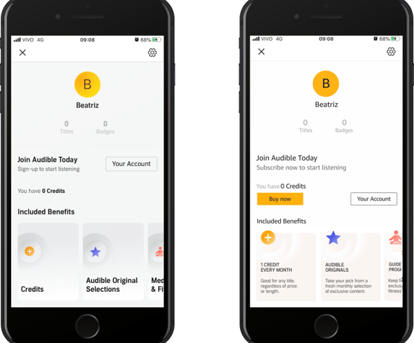
The original Profile screen is on the left and my suggestion is on the right.
Despite the text saying to "Join Audible Today", there are no links or buttons to join Audible.
It's written "Sign-up to start listening", but when I opened the app, they made me sign in already using my Amazon e-mail account.
There's no "Buy now" button next to the "You have 0 credits", and no message telling me where I need to go to buy credits.
The orange plus button isn't a button, but looks like one.
The "Credits" content doesn't show where I need to go to buy credits.
Profile screen issues
My suggestions
Audiobook screen issue
After you search for a book, it opens the selected audiobook screen giving you the option to hear the preview.
The main issue is that there is no "Buy now" button after the Credits. This is not facilitating the path for those who don't have credits at the moment and really want to listen to the audiobook.
There is this interface issue worth mentioning. Having three giant buttons with no hierarchy makes the user take more time before taking action.
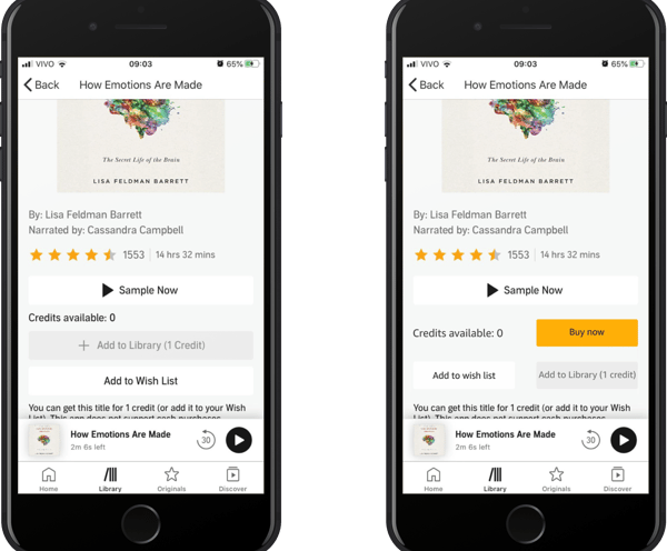
The original Audiobook screen is on the left and my suggestion is on the right.
My suggestions
I made just a few changes here:
Included the Buy button.
Changed the size of the two buttons below.
Decreasing the size of the buttons, created more space for the buttons and also led the "Sample Now" more visible
The player issues
The player is the screen you see when you tap to listen to the sample of the audiobook.
The chevron down isn't in the same position as the other pages. In this screen, this component is too close to the header, so I ended up leaving the app (you can see this "accident" in the video below).
Another thing you can see in the video is me trying to close this window completely, which is not possible. It's sad because it occupies a big part of the screen unnecessarily.
Inconsistency Costs More Time than It Saves
I have two suggestions for this screen.
I changed the position of the chevron to become just like it is on the other pages. This creates consistency, which is the fourth Nielsen & Norman Usability heuristic.
I added at the top right, the close button component so that the user can exit this screen completely. This covers the third Nielsen & Norman Usability Heuristic that, in summary, says: "Users often make mistakes or change their minds. Allow them to exit a flow or undo their last action and go back to the system’s previous state."
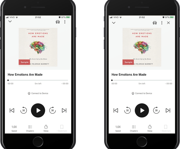
The original Player screen is on the left and my suggestion is on the right.
I suggest after the user logs in for the first time on the app, a welcome screen to create a more customised experience while using the app.
One important thing worth mentioning is that I'm giving the user the choice to skip this page by clicking on "Maybe later".
I created this page because I would like to see audiobook suggestions from the categories that I'm interested instead of seeing random audiobooks.
Create a Welcome screen

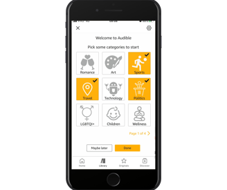
My Welcome page suggestion
There are things that I didn't mention in this review, but it would be "nice to have":
Search audiobooks by categories.
Local cookies or a history of the books that I've searched before.
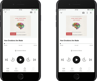
This is the video I created while using the app for the first time.
